W10.2 May 10 (Fri) extra credit 2
1. Visibility and accessibility
Whyte’s perspective: Whyte emphasizes that the success of public spaces relies heavily on their visibility and accessibility. An obvious entrance and clear path are crucial.
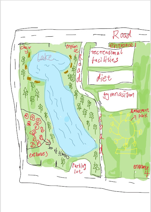
Map analysis: In this map, the main entrance is clearly marked and the path is intuitive, helping visitors to easily enter and navigate the park.
2. Gathering and activity areas
Whyte's take: People tend to stay and move where they can see other people, he points out. Therefore, the design should encourage gathering areas with high visibility.
Map analysis: The map has simple but prominent icons for rest areas and playgrounds, which are key areas that promote social interaction.
3. Simplicity and usability
Whyte’s point of view: Whyte believes that the design of public spaces should be simple and intuitive, and its purpose can be understood without additional instructions.
Map Analysis: The simple design of the map is consistent with this theory, avoiding too many complex elements and allowing visitors to quickly understand the spatial layout.
4. Natural environment and space use
Whyte's take: Whyte mentioned the importance of greenery and open space.
Map analysis: The plant coverage of the map is very sufficient. There is also a sea of flowers. There are also plenty of trees. Shade can be provided for people to rest.
5. The importance of seating and rest areas
Whyte's point: Whyte emphasized the role of the seat. Sufficient seating and rest areas can attract people to rest and entertain.
Map analysis: There are plenty of seats and resting places by the lake. Designing seats next to the lake also allows people to enjoy the beautiful scenery of the lake. Relaxation can be achieved quickly.

Comments
Post a Comment